SHARKSEEK
An Art 249 Project
Conceptual Planning
Research
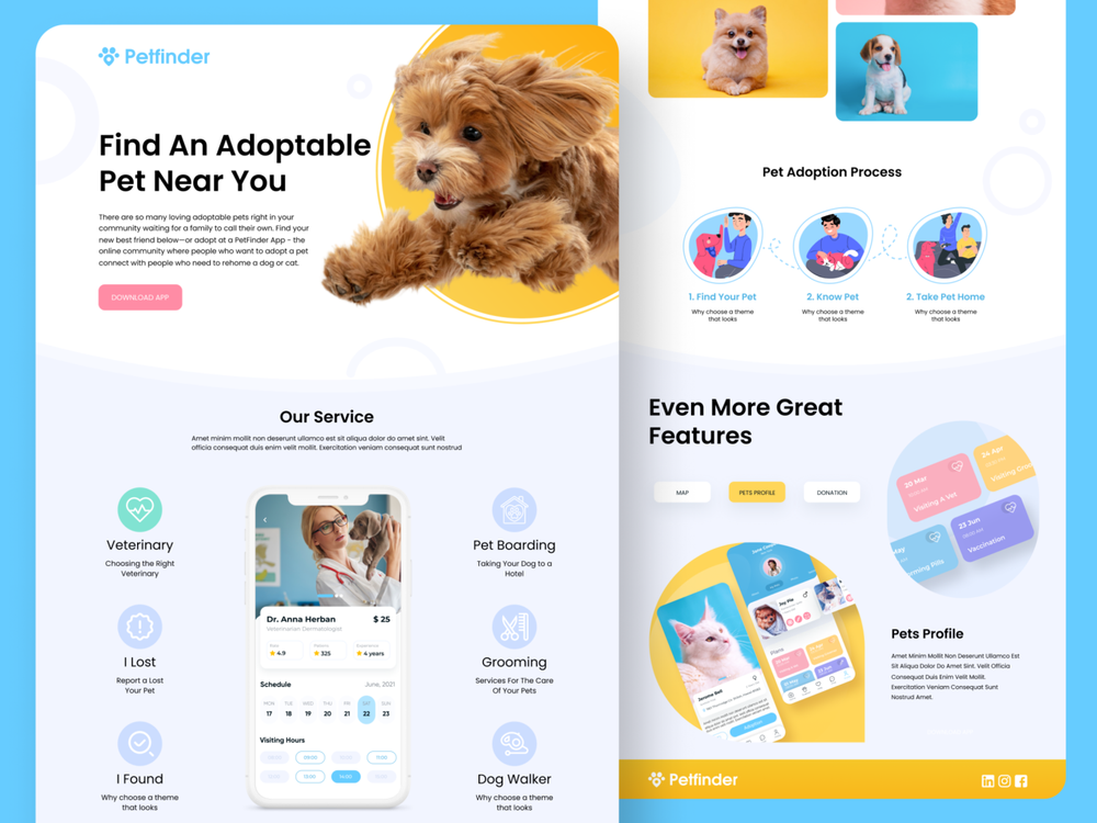
I spent a bit of time looking at other pet adoption apps and websites trying to get the right vibe of what I wanted in my app. Since this was a parody app, researching similar apps but putting a bizarre twist on it was my ultimate goal.
Lo-Fi Wireframe
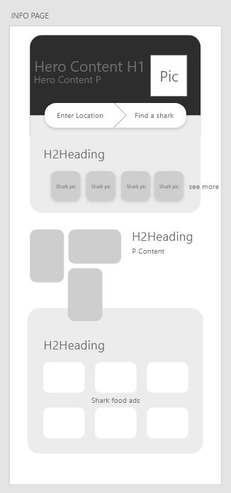
I did all my sketching in adobe XD this time around and came up with a solid base to work on. Maybe creative breakthroughs come more easily when you're stressed for time, but this first lo fi UI came pretty easily.
Hi-Fi Wireframe
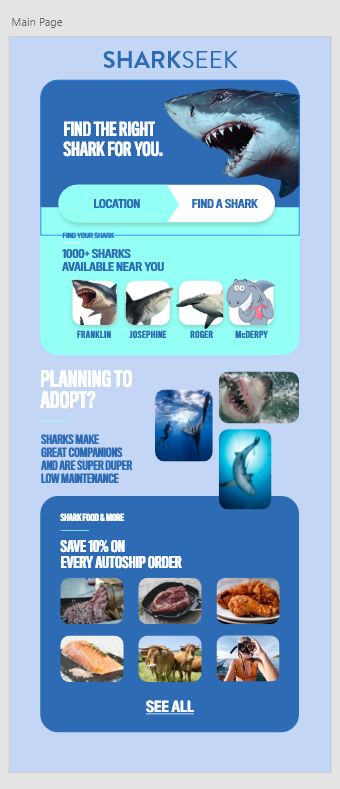
Not much changed from the original design to this. The layout stayed 90% the same. By having a solid base to work on, adding color and graphics was a lot easier this time around.
Challenges
Was this project an afterthought?
First off, I just want to say, that this UI came out better than I thought. I sped designed it over a day and the outcome was pretty darn good. However, part of me thought I didn't put enought effort into it. My rampant OCD makes me question things such as this. If I had more time, this UI could've been 5 times as good, but due to time management and placing more effort into my client site, this project is definitely a bit lackluster. In the real world, you have to prioritize what is more critical when it comes to your assignments and unfortunately this was a lower priority. That being said, I still accomplished everything asked of me, and that feels pretty darn good.
Summary
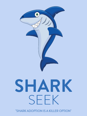
Sharks need love too!
Time management. Its something new that I'm still working on... But just look at this cute little landing page. It's silly, its a bit wonky, but there was SOME thought put into it. Its not the best. Its not the worst. Its ok and it works.